Mentalligence — brand identity and website development for an author and professor.
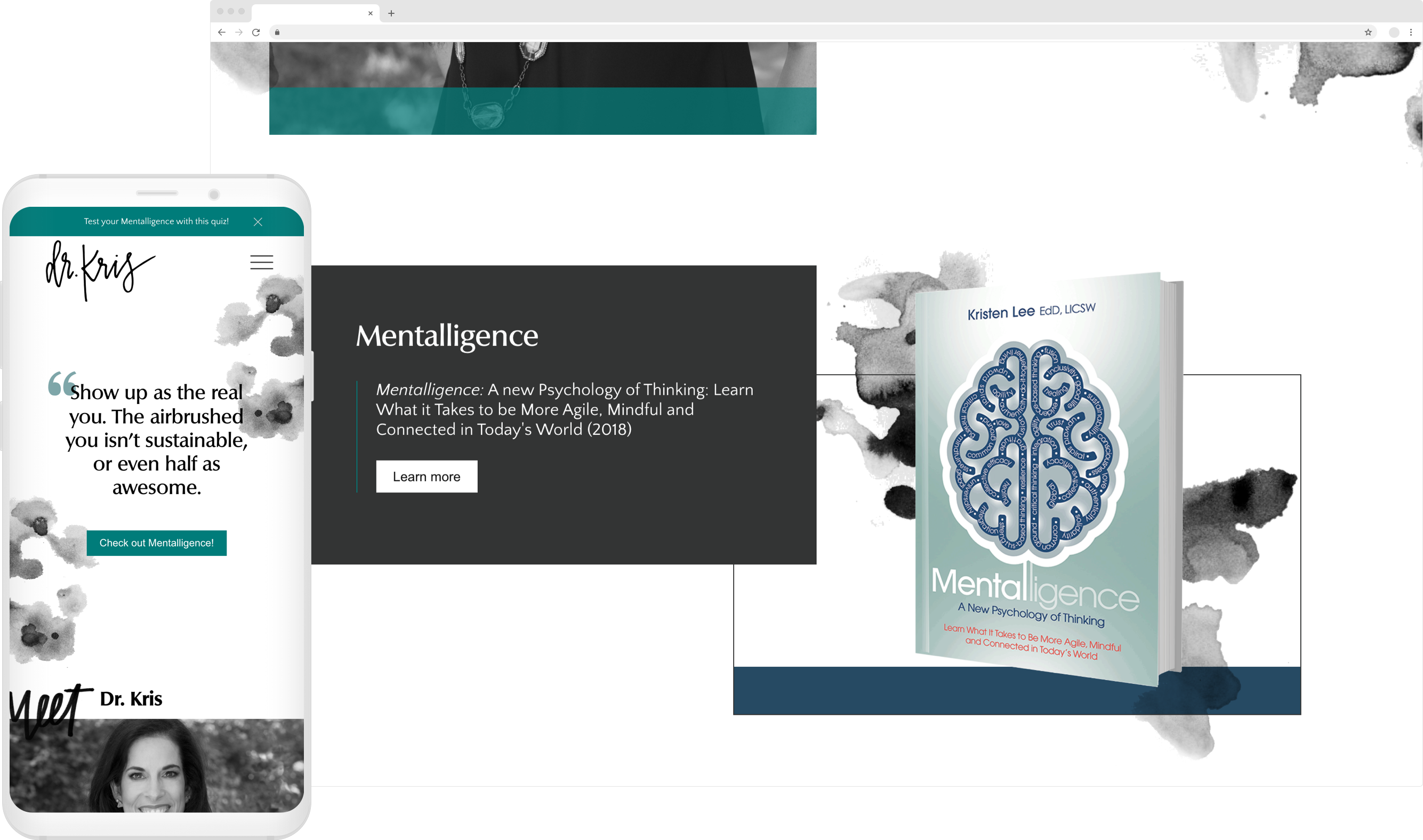
Introducing my first studio project
My first client project at Scout Studio, was for Dr. Kristen "Kris" Lee, the department head of Behavioral Sciences at Northeastern and author of RESET. She has spoken at many events, giving tips to deal with stress, highlighting the importance mental health, and promoting mindfulness.
Through a few scoping and prioritization exercises our team took on the task of creating an entire brand, fully custom website, and collateral for Dr. Kris to use on social media and at her upcoming TEDx talk.
How might we build an accessible platform of reputable resources curated by Dr. Kris and utilize a unified brand to promote Mentalligence?
Requirements gathering
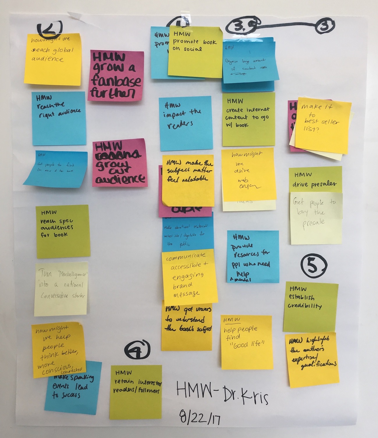
Our team consisted of four members: a project lead, two other designers, and myself acting as the sole developer and helping with UX design. Before our team began work on any designs or wireframes we first conducted a few brainstorming exercises, consisting of brand analysis, requirements gathering for the website, and persona development for her target audience.
This was my first time doing these activities in a real-world scenario and the experience was invaluable in terms of planning down the road for what we had to accomplish. The "How Might We" exercise (HMW) shown is something I have brought to various teams.
Defining colors and typography
After determining the brand's voice and tone our team worked on creating a color palette and type pairings that helped to convey that. To express the client's desire of professionalism we opted for a subdued color palette, balancing it out with more humanistic typography to avoid falling into a sterile feel.


Building to grow
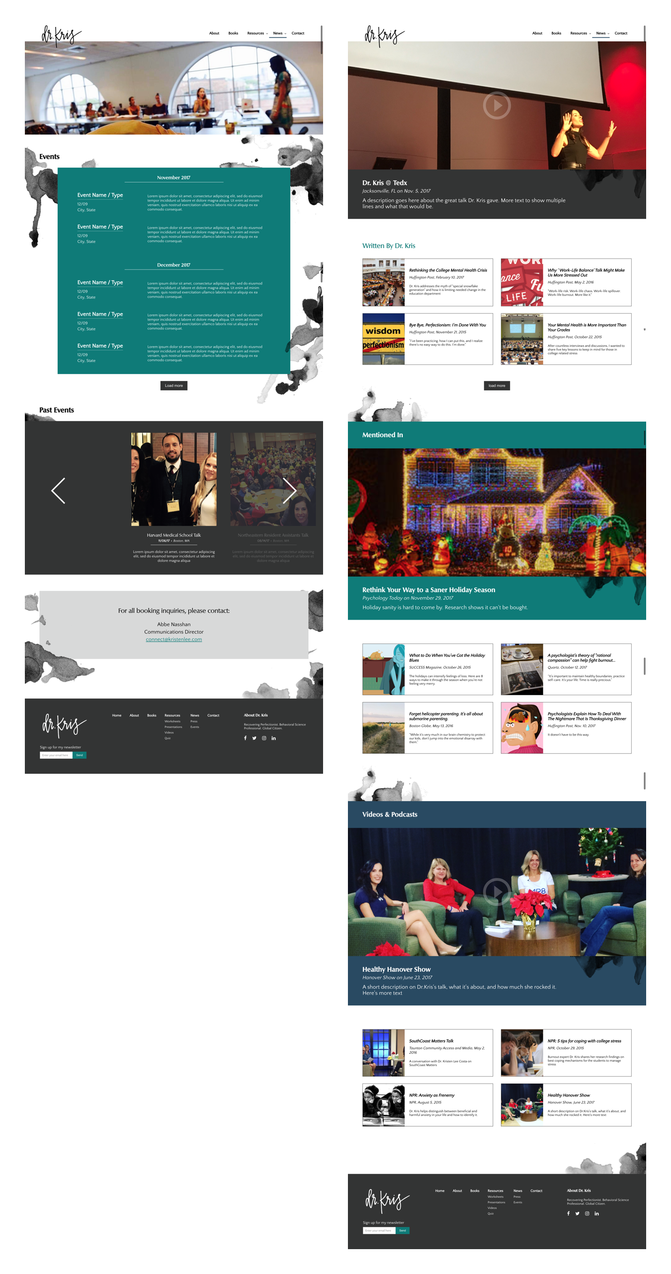
A key aspect of the website was the ability to scale — for Dr. Kris to be able to control the content herself, without relying on a developer for every change. To accomplish this, we built the site on top of a CMS called "Craft", built in PHP.
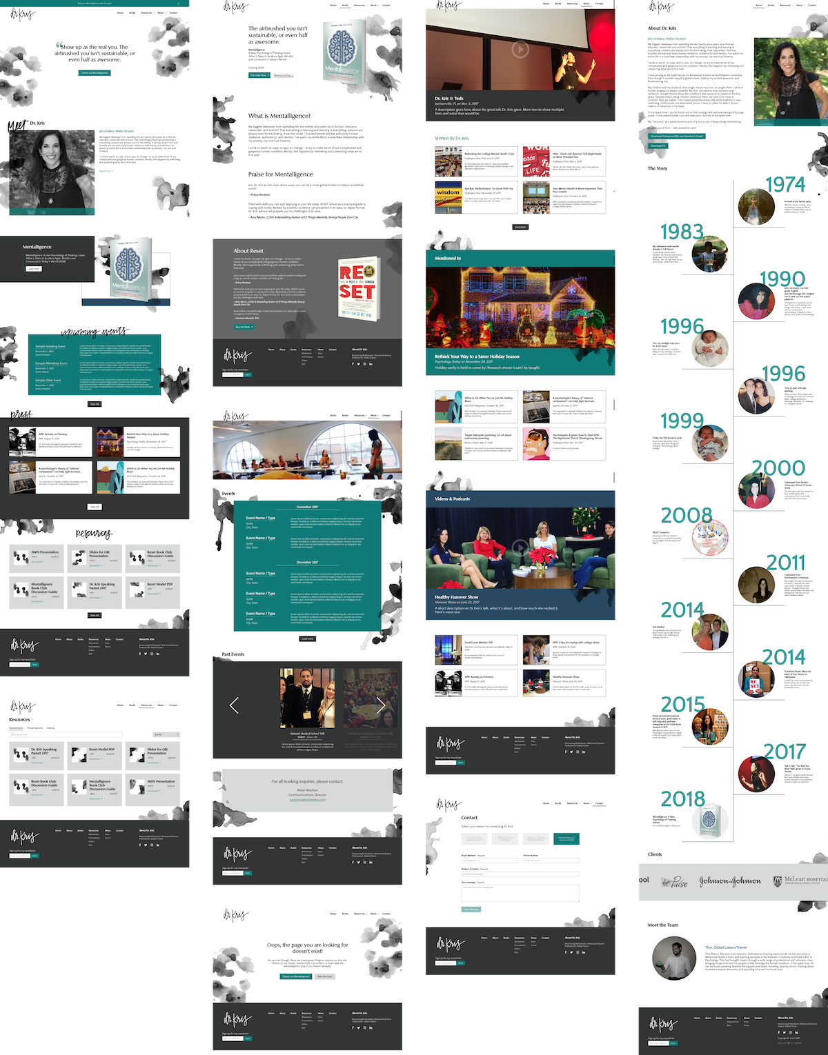
The majority of the screens I was responsible for designing were more data driven. Even before I began building in Craft I had to think about how I wanted the data structures and fields to be setup. I had to balance both ease of use for the client while creating content that can be queried efficiently.
Designing an interactive quiz
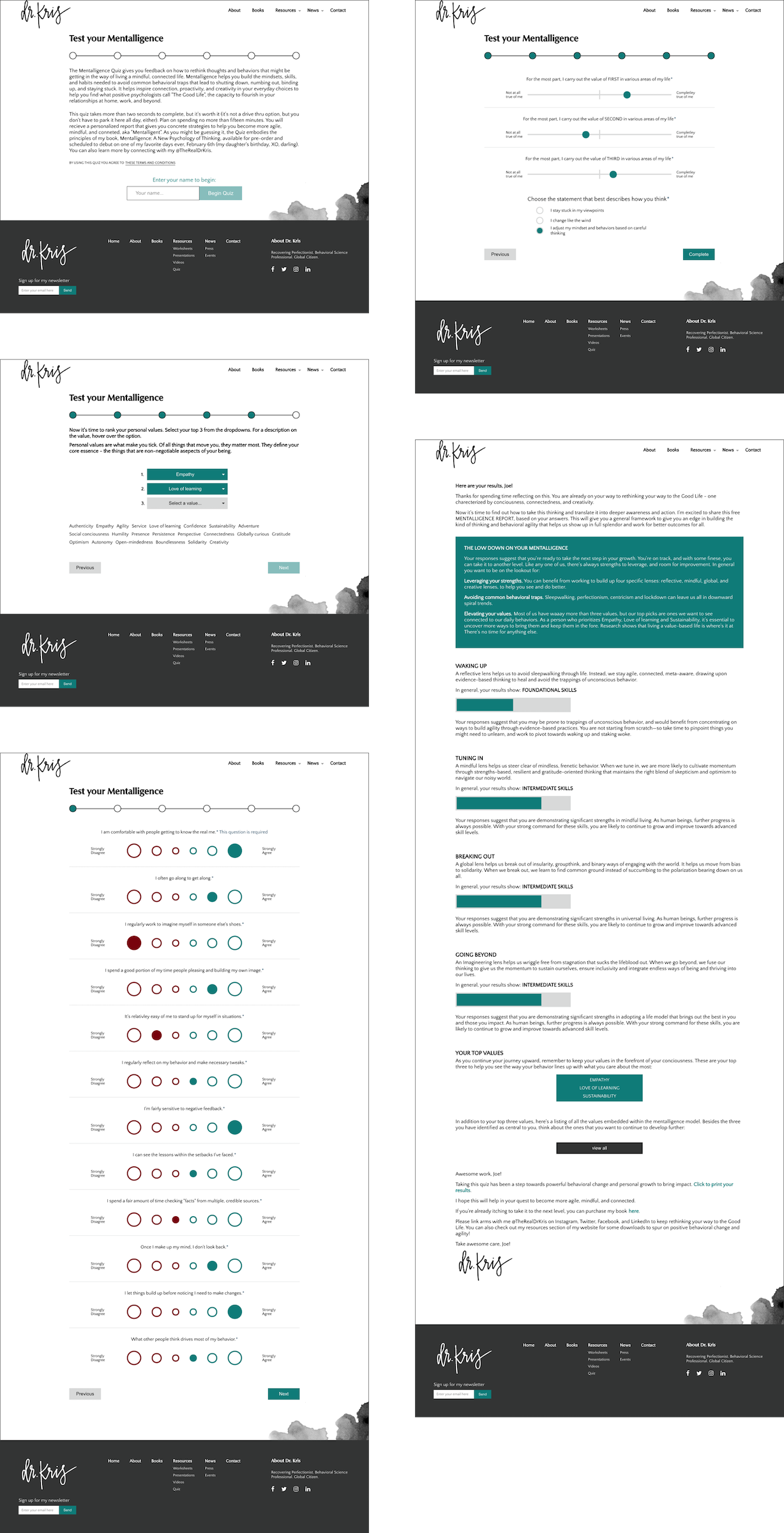
In addition to building the informational portions of the website, I was put in charge of creating an interactive quiz dealing with topics from Dr. Kris’ new book. I accomplished this using Vue.js — a Javascript framework similar to React that helps create adaptable front-ends.
My reasoning for choosing Vue was because I was more familiar with it at the time and that it has less overhead than similar libraries such as React or Angular.
A few final touches
The final touches I made to the site included a loading transition for the homepage and a menu animation on mobile.
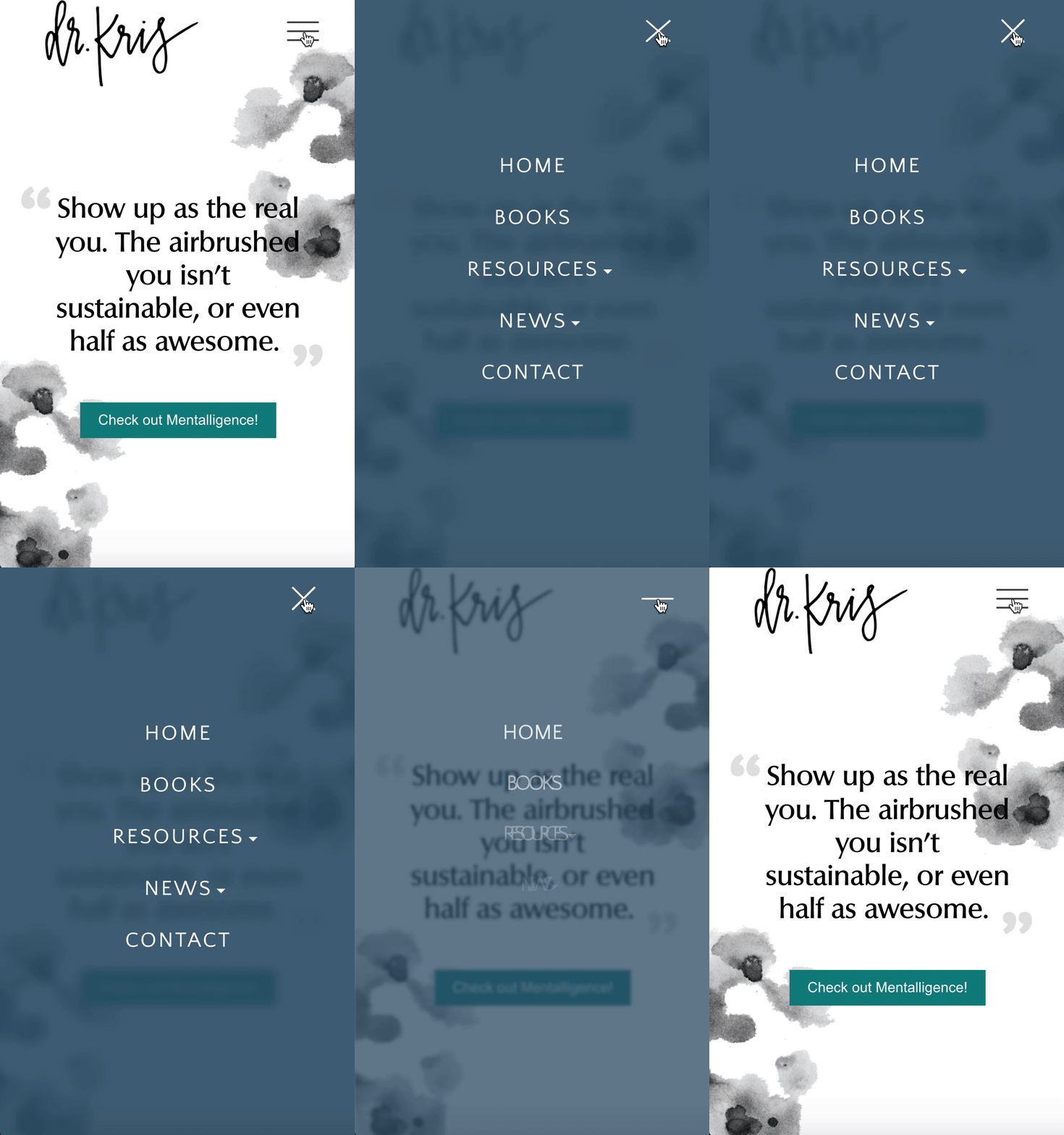
For the mobile menu transition I wanted to create a motion that seemed sleek and fluid, but wasn't overly exaggerated. I had the menu icon transition state to show clear controls and opted for a semi-transparent, blurred overlay rather than a solid color to keep the subdued theme of the site.
The takeaway from my first Studio team
This was my first client project as a member of Scout Studio and I can honestly say that I had a blast. Being able to design and brand for an actual person rather than a company or product was a unique experience that allowed me to grow as a designer.
The small team dynamic allowed me to take on more responsibility, thus making the most out of my experience. While I was the only developer, I enjoyed being able to take charge of the task as well as learn to communicate better with designers as well as advocate for myself.
View completed site