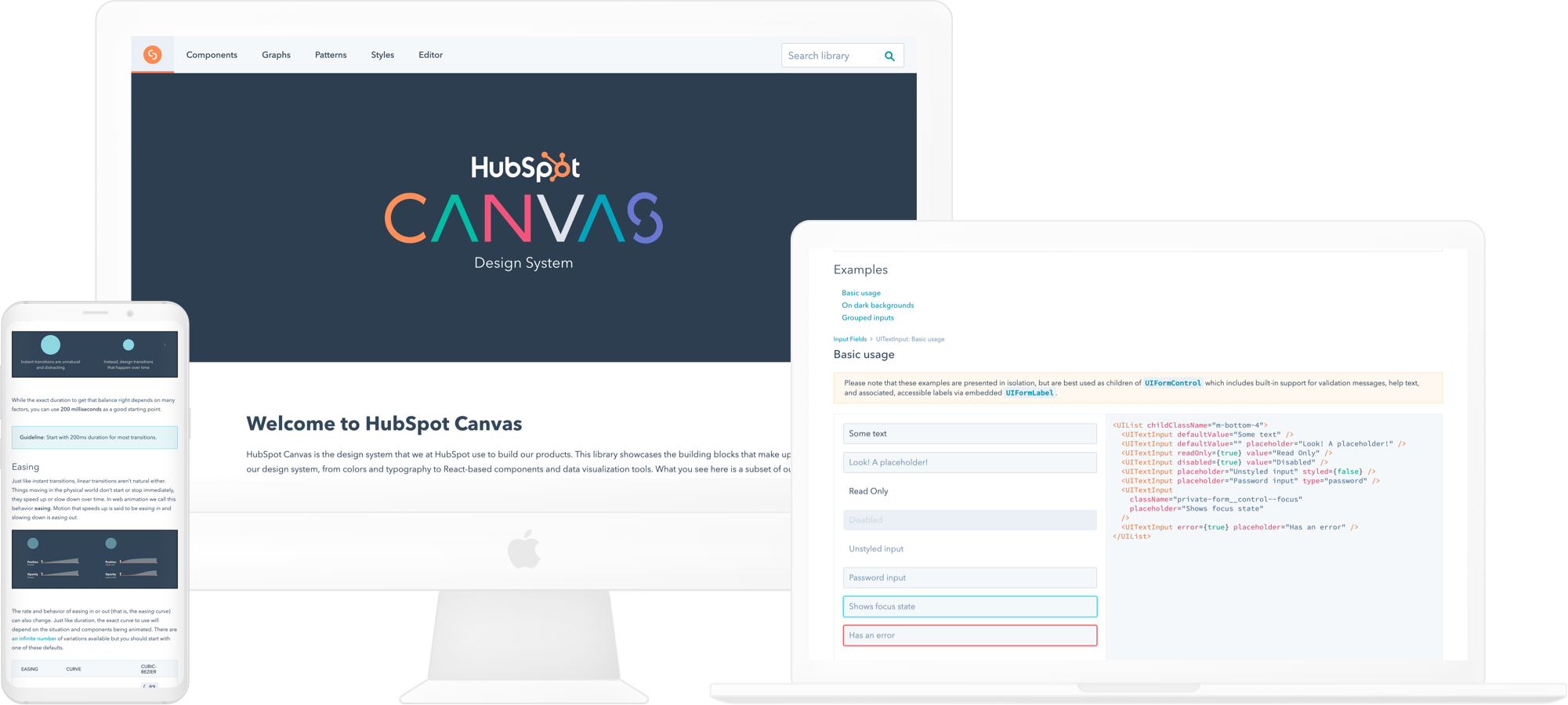
HubSpot Canvas — maintaining a first-class design system that scales.
My time with FaaS UI working on Canvas
Coming back to HubSpot on my third and final co-op, I was placed on the "Front-End as a Service" (FaaS) UI team. The teams mission was to create and maintain a design system of reusable components, Canvas, to empower teams to build products more quickly, and in a maintainable way.
I joined the team at the start of January 2019, and stayed on until June. During that time I was able to take on responsibilities such as creating new components, updating existing components for product teams, and thinking of ways to improve the existing Canvas design system.
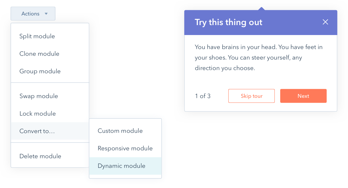
Building out new components
One of my favorite aspects of my position was working with designers and developers to build out new components for the design system.
New functionality was exciting to introduce, but some of the most rewarding parts of building the new components was ensuring accessibility and ease of use for developers across the various components that the new one could be used with.
Maintaining an evergreen design system
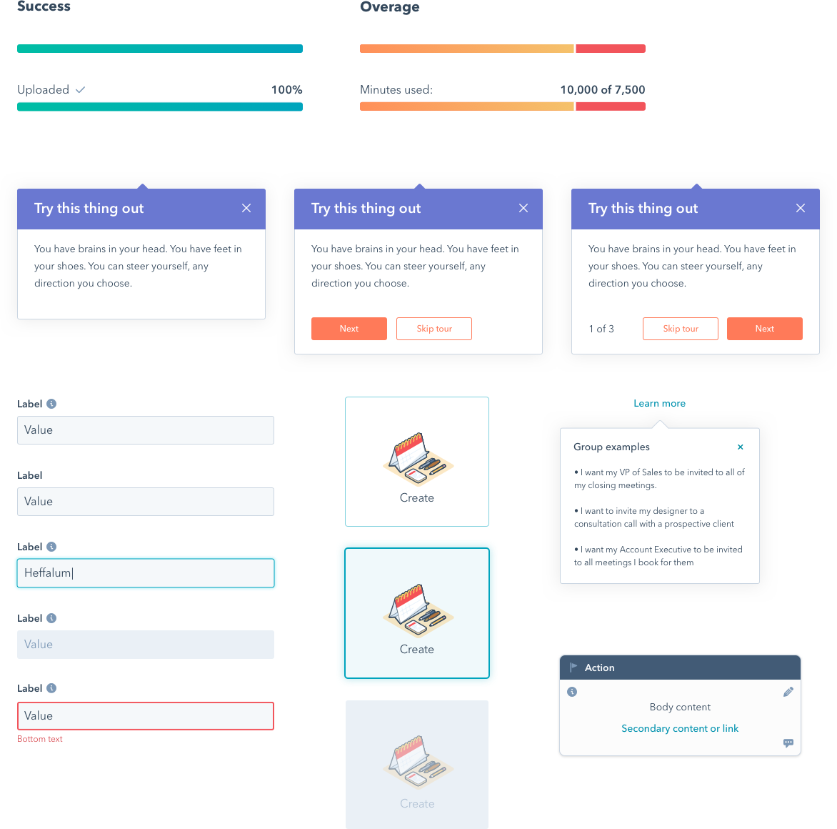
A design system is bound to fail if it cannot grow with the product. A core responsibility of the FaaS UI Team is to respond to Product team feedback to ensure the components can be used as intended.
Refactoring old components was where most of my time was spent while a part of the team. This doesn’t just mean bug fixes, however — components are redesigned as seen fit based on the current needs of designers, developers, and PMs. A design system is a living, breathing thing that cannot stay static to when a feature was first introduced.
Redesigning the UI Library's "spec page"
My final project on FaaS UI was kicking off the initiative to give the UI Library a needed refresh. Designers have found it difficult to use and there hasn't been much UX thought put into it after its initial creation in 2016.
Before I left I was able to tackle some of the most used pages in the Library: the component "spec" pages — which serve as the documentation for our reusable React-based components.
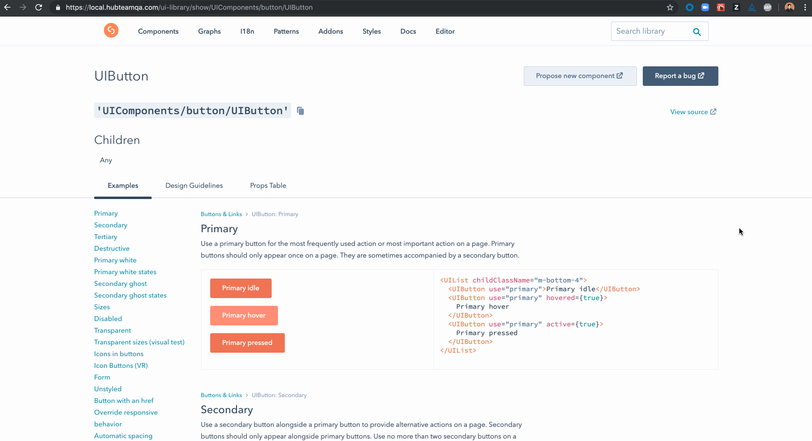
One of the key changes I made was to separate the content into different tabs to make it easier for designers and developers to know where to go to find the information they are looking for.
Additionally, my changes gave "design guidelines" a more prominent home in HubSpot's documentation, allowing for more design and UX guidance to be added in the future.
A retrospective on my time with FaaS UI
My time on FaaS UI was a very unique and exciting experience. While I was hired as a Software Engineer, the team structure and responsibilities allowed me to also dive into the design process at HubSpot and what it was like to maintain a design system. I was even given the opportunity to lead the redesign of the UI Library: an internal tool used by every designer and front-end engineer on Product.
Learn more about Canvas