Generate Website Redesign — complete visual, UX, and website overhaul.
Problem setting - what is Generate?
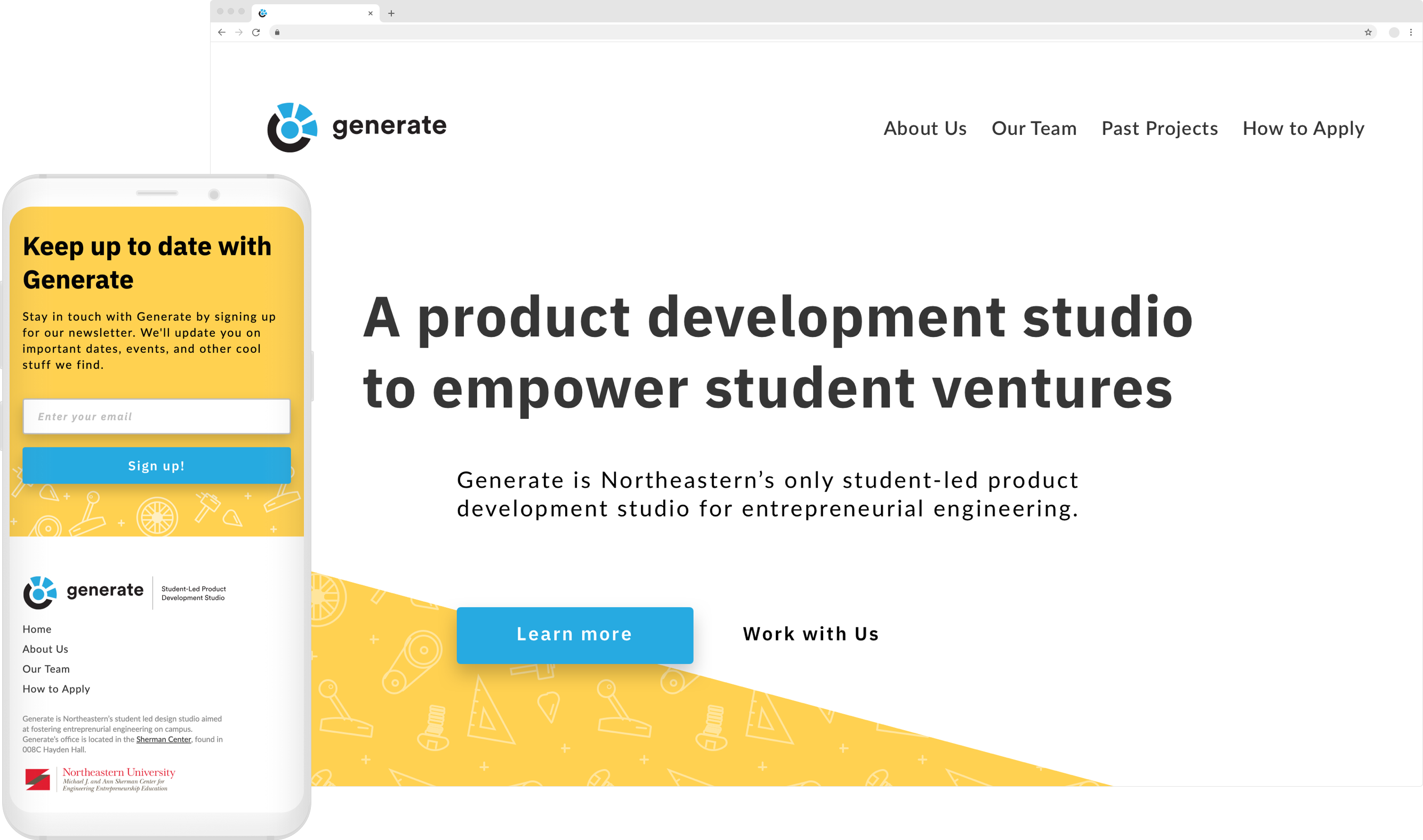
Generate is a product development studio at Northeastern that aims to unite tech minded individuals on campus, while also taking on semesterly clients to build out hardware products as part of their Build Studio.
Their issue was that they had a very poor website that didn't really showcase what Generate was all about. I came on as their Web Designer and Developer to overhaul their site - which included their established brand.
How might we create an engaging online brand that showcases our story and draws attention from prospective students?
Information architecture revamp
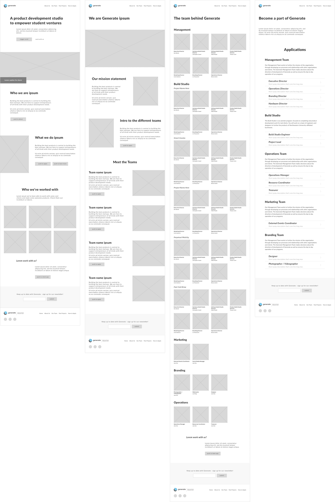
The first part of the process was determining what information was pertinent to Generate and what was the best way to organize it. I started by interviewing directors of the organization to get a sense of what they wanted on the new site and translated those findings into some requirements.
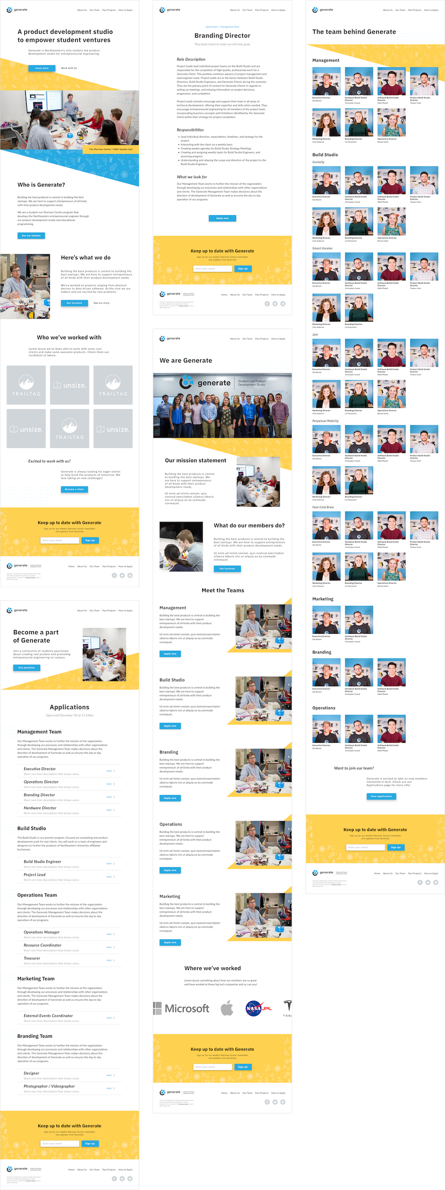
From those interviews, I was able to begin creating a new IA schema which led into initial wireframes. After a few rounds of designs and revisions, I moved to creating digital sketches with more of the fine details of spacing and layout incorporated. Increasing fidelity at each step of the process allowed for larger UX details to be straightened out before getting caught up in the more visual aspects.
Determining a brand direction
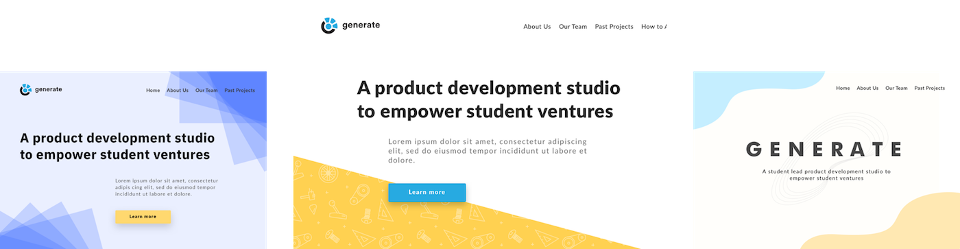
While creating the wireframes I also created a few mockups to help determine what Generate's web brand would be. I took a modified approach from style-tiles, with an emphasis on showcasing the same section of the page to not introduce additional factors for participant feedback. Below are three options I created, with the center being the one that was chosen.
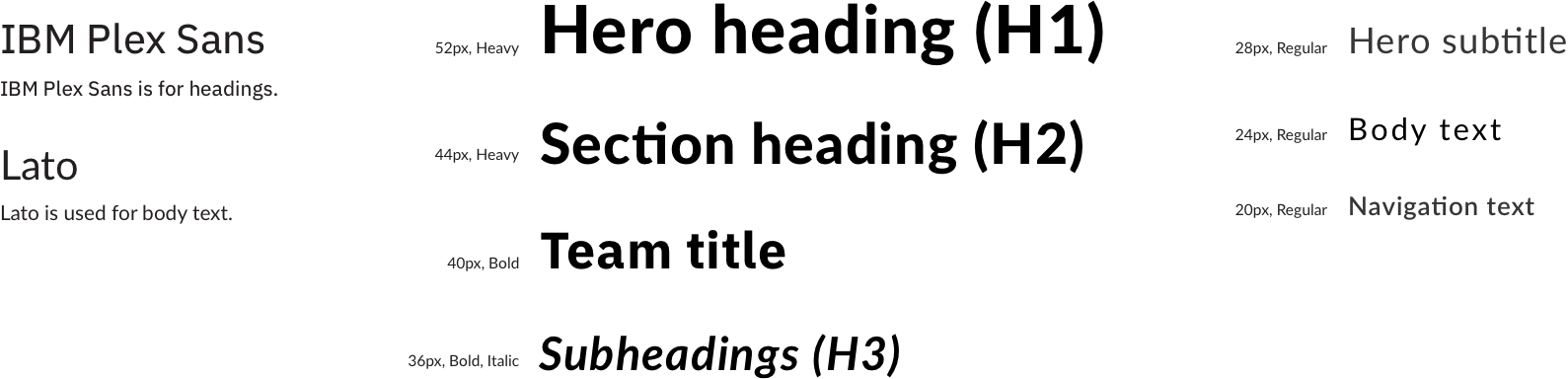
Refreshing a brand for the web
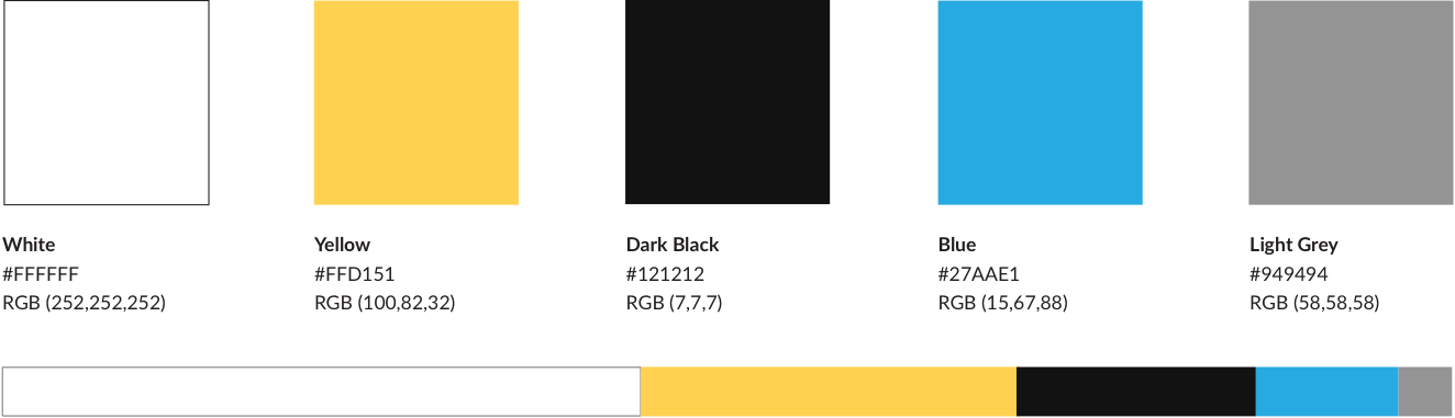
The original site and brand focused primarily on the blue color featured in the organization’s logo. I found that color difficult to work with, both in terms of accessibility and pairing it with dynamic content such as images.
To overcome this dilemma, I opted for a palette swap of the brand’s colors — focusing more on the yellow as the primary accent color with a lot of white space to create a more open feeling. Below are the finalized brand colors and typography options.
Finalizing hi-fidelity mocks
Overall I had positive feedback regarding the updated branding of Generate, even with initial hesitation of the directors of cutting back on Generate’s primary color.
With the branding of the website solidified, I began putting time into finishing the design of the rest of the pages, including the templates for the dynamic position listings.
Taking it live - from design to code
Northeastern organizations must use Wordpress to host on their domain, which was a limitation I was aware of when starting this project. I decided to use Timber coupled with ACF to build out a custom theme, due to the fact that it is arguably easier for future devs to make updates since it uses templating markup that is more familiar than traditional PHP files.
A key part of the development overhaul was to allow for future Generate members to be able to update the site’s information, without the need of a developer. After handoff I was so pleased to see the Generate team making use of the new design and creating new posts that needed a developer in the past. This wasn’t just a visual refresh — it was an entire process upgrade for the Generate team.
View live site