Boo! Boston — designing an AR app using service design concepts.

An AR mobile app with a service model
Boo! Boston was a semester-long project for my Interaction Design 2: Mobile course. For this project, we worked with a real client to design an augmented-reality mobile app with the goal of promoting tourism of families in Boston.
Each team was given a different neighborhood to tailor their service toward. My team was given the Fenway neighborhood.
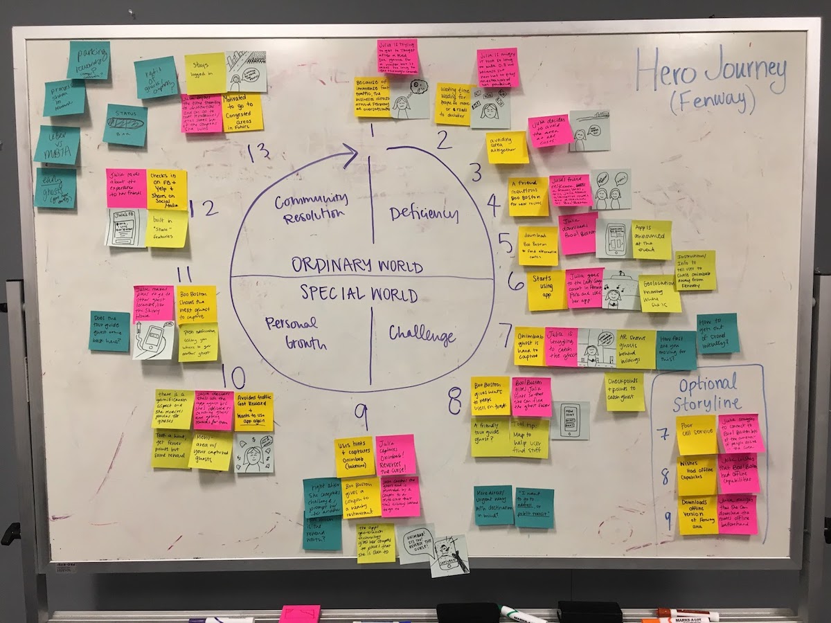
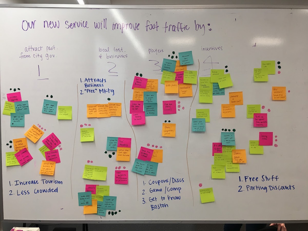
Discovery phase: journey maps & service models
Given how busy Fenway can become on game days, our team decided to utilize the ghost finding mechanic of the app to guide users away from crowded sections of the neighborhood, providing a more enjoyable experience to users and potentially more business to smaller, family owned businesses.
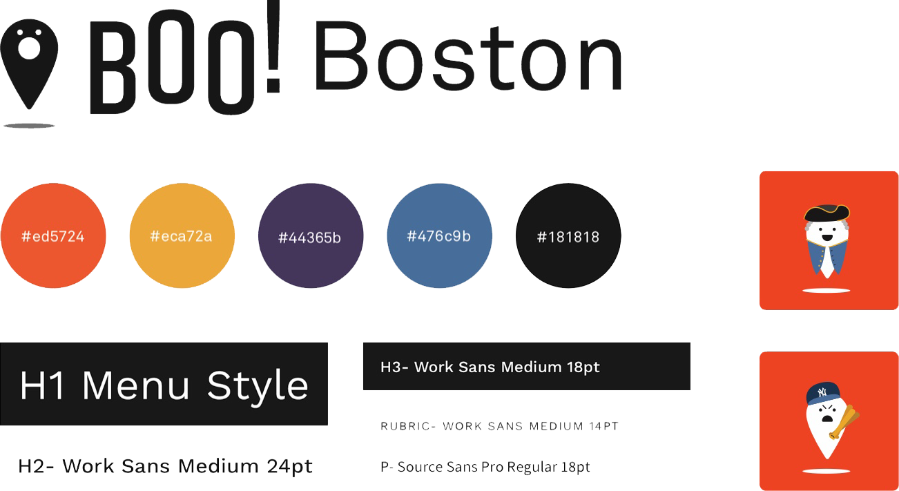
The branding elements of Boo! Boston.
The core demographic of the Boo! Boston app is families, so we wanted to ensure that the brand would be appealing to a wide range of ages.
To do this, we opted for bold colors and clean, sans-serif typefaces to create a modern feeling brand. Even though this would be a government backed app, we wanted to create a more playful and fun energy.
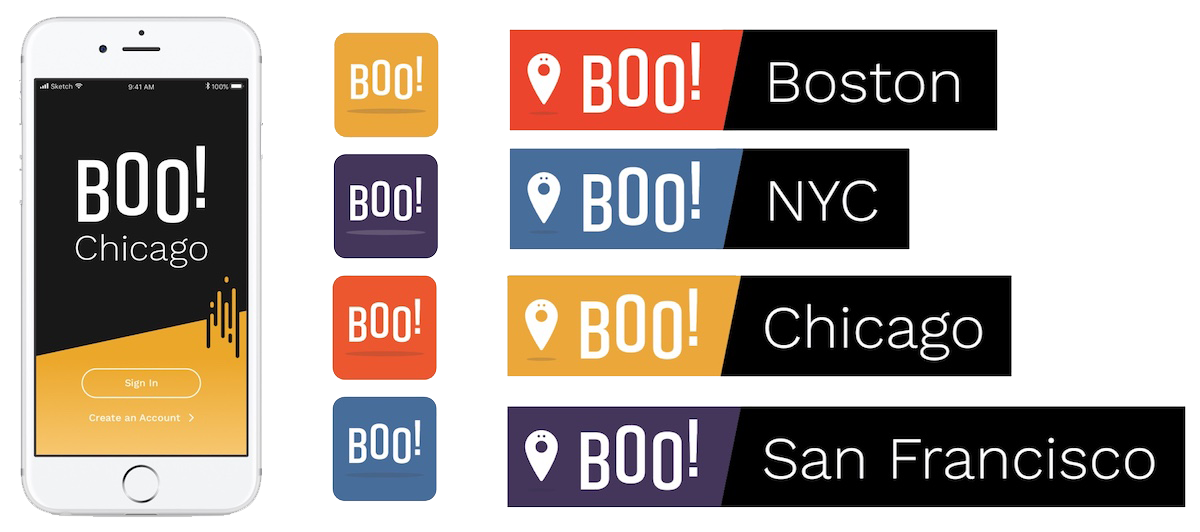
Versatile branding
The brand of Boo! Boston was created with expandability in mind. If brought into new areas, each city could use its own variation of the brand for unique splash screens, app icons, and taglines.
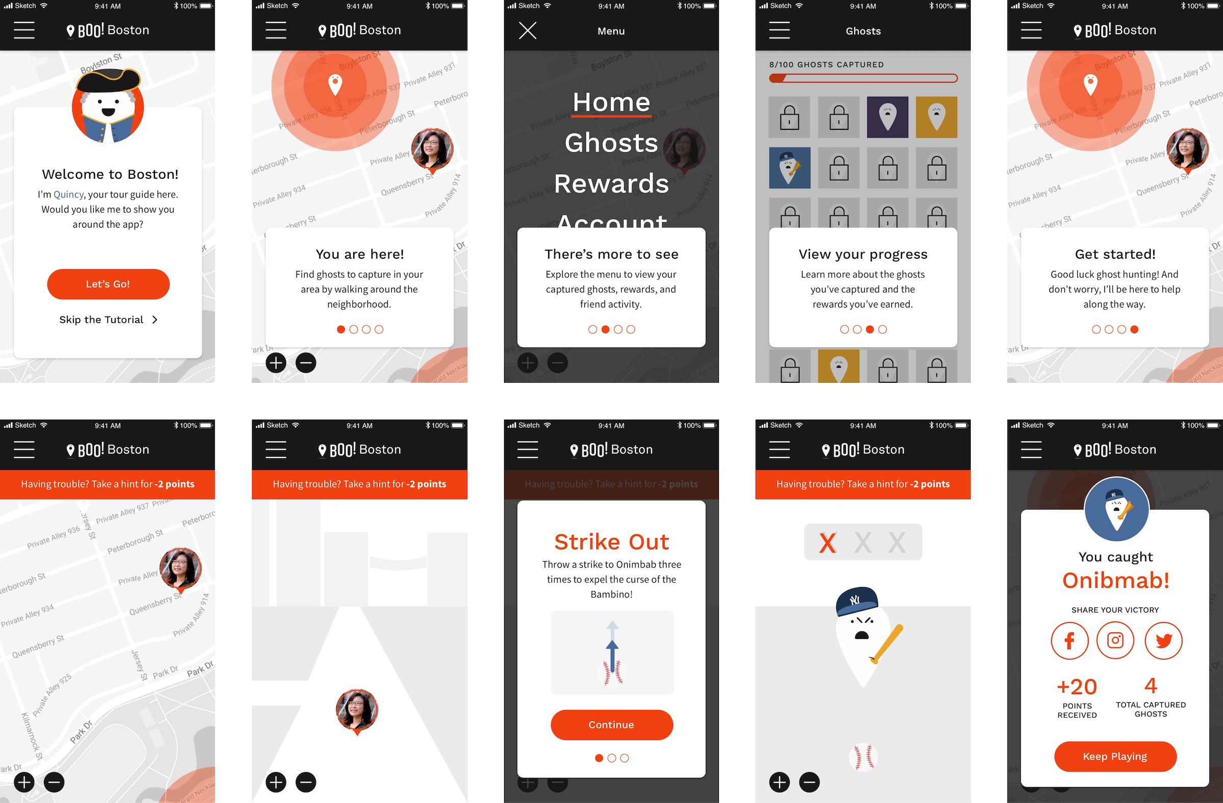
The finalized UI and prototype
Taking our branding elements and original UI wireframes, our team built out the final screens for our prototype. The image above showcases screens from on-boarding and the “find and catch” ghost gameplay.
View InVision prototype